选项卡 - Tabs
使用$.fn.tabs.defaults重载默认值。
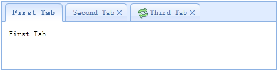
这个选项卡显示面板的集合。它显示了只有一个选项卡面板在一个时间。每个选项卡面板的标题和一些迷你按钮的工具,包括关闭按钮和其他定制按钮。
依赖组件(Dependencies)
使用方法(Usage Example)
Create tabs
1. 使用HTML标签创建选项卡
使用HTML标签创建选项卡十分简单,不需要写任何javascript代码,只需要<div>标签引用'easyui-panel'类。每个选项卡面板都可以使用闭合的<div>标签对创建,使用方法跟创建控制面板一样。
2. 使用脚本创建选项卡
下面的代码演示如何使用脚本创建选项卡,当该选项卡被选择时将会触发'onSelect'事件。
添加一个选项卡
添加一个新的标签页面板与迷你工具,迷你工具图标(8×8)被放置在关闭按钮。
获取当前被选择的选项卡
属性(Properties)
| 名称 | 类型 | 描述 | 默认值 |
|---|---|---|---|
| width | number | 选项卡所在容器(控制面板)的宽度。 | auto |
| height | number | 选项卡所在容器(控制面板)的高度。 | auto |
| plain | boolean | 如果设置为true,将不显示控制面板背景。 | false |
| fit | boolean | 设置为true时,选项卡的大小将铺满它所在的容器(浏览器)。 | false |
| border | boolean | 如果设置true,将显示选项卡所在容器(面板)的边框。 | true |
| scrollIncrement | number | 选项卡滚动条每次滚动的像素值。 | 100 |
| scrollDuration | number | 每次滚动持续的时间,单位为毫秒。 | 400 |
| tools | array,selector |
控制面板右侧的工具栏:
1.每个工具选项都跟链接按钮一样。
2. 一个选择器指向< div / >包含工具。
Code example: Define tools with an array. $('#tt').tabs({
tools:[{
iconCls:'icon-add',
handler:function(){
alert('add')
}
},{
iconCls:'icon-save',
handler:function(){
alert('save')
}
}]
});
Define tools with a exist DOM container. $('#tt').tabs({
tools:'#tab-tools'
});
<div id="tab-tools">
<a href="#" class="easyui-linkbutton" plain="true" iconCls="icon-add"></a>
<a href="#" class="easyui-linkbutton" plain="true" iconCls="icon-save"></a>
</div>
|
null |
事件(Events)
| 名称 | 属性 | 描述 |
|---|---|---|
| onLoad | panel | 当一个选项卡完成ajax远程载入对象时触发。 |
| onSelect | title,index | 当用户选择一个选项卡时触发。 |
| onBeforeClose | title,index | 在一个选项卡被关闭之前触发,返回false将取消关闭。下面的例子展示了如何显示确认对话框之前关闭选项卡面板。 $('#tt').tabs({
onBeforeClose: function(title){
return confirm('Are you sure you want to close ' + title);
}
});
// using the async confirm dialog
$('#tt').tabs({
onBeforeClose: function(title,index){
var target = this;
$.messager.confirm('Confirm','Are you sure you want to close '+title,function(r){
if (r){
var opts = $(target).tabs('options');
var bc = opts.onBeforeClose;
opts.onBeforeClose = function(){}; // allowed to close now
$(target).tabs('close',index);
opts.onBeforeClose = bc; // restore the event function
}
});
return false; // prevent from closing
}
});
|
| onClose | title,index | 在用户关闭一个选项卡面板后触发。 |
| onAdd | title,index | 在一个选项卡面板被添加后触发。 |
| onUpdate | title,index | 在一个选项卡面板被更新后触发。 |
| onContextMenu | e, title,index | 在一个选项卡面板被鼠标右键单击后触发。 |
方法(Methods)
| 名称 | 属性 | 描述 |
|---|---|---|
| options | none | 返回选项卡属性对象。 |
| tabs | none | 返回所有的选项卡面板。 |
| resize | none | 重置选项卡容器(面板)大小并且自动布局。 |
| add | options | 添加一个新的选项卡面板,options参数是一个可以配置的对象,查看选项卡控制面板属性获取更多信息。// add a unselected tab panel
$('#tt').tabs('add',{
title: 'new tab',
selected: false
//...
});
|
| close | which | 关闭一个选项卡面板,title参数表示哪个选项卡将被关闭。 |
| getTab | which | 获取特定的选项卡面板名称。 |
| getTabIndex | tab | 获取指定的选项卡面板索引。 |
| getSelected | none | 获得选中的选项卡面板。下面的例子显示了如何获取索引指定的选项卡面板。var tab = $('#tt').tabs('getSelected');
var index = $('#tt').tabs('getTabIndex',tab);
alert(index);
|
| select | which | 选择一个选项卡面板。 |
| exists | which | 验证一个特定的选项卡面板是否存在,参数'which' 可以指向选项卡面板标题或索引的。 |
| update | param | 更新特定的选项卡面板,param参数包含2个属性: tab: 将被更新的选项卡。 options: 选项卡相关配置项。 Code example: // update the selected panel with new title and content
var tab = $('#tt').tabs('getSelected'); // get selected panel
$('#tt').tabs('update', {
tab: tab,
options: {
title: 'New Title',
href: 'get_content.php' // the new content URL
}
});
|
| enableTab | which | 使指定的选项卡面板 'which' 参数可以标题或索引的选项卡面板。这个方法是可用的,因为1.3版本。
示例: $('#tt').tabs('enableTab', 1); // enable the second tab panel
$('#tt').tabs('enableTab', 'Tab2'); enable the tab panel that has 'Tab2' title
|
| disableTab | which | 禁用指定的选项卡面板,'which' 参数可以标题或索引的选项卡面板。这个方法是可用的,因为1.3版本。 示例: $('#tt').tabs('disableTab', 1); // disable the second tab panel.
|
选项卡面板
选项卡面板属性在控制面板组件中定义,以下是一些常用属性。
| 名称 | 类型 | 描述 | 默认值 |
|---|---|---|---|
| id | string | 选项卡面板的ID。 | null |
| title | string | 选项卡面板的标题。 | |
| content | string | 选项卡面板的内容。 | |
| href | string | 从超链接载入远程内容到选项卡 面板。 | null |
| cache | boolean | 设置为true将缓存选项卡面板,当href(超链接)属性被设置时有效。 | true |
| iconCls | string | 一个显示选项卡面板标题图标的CSS类。 | null |
| width | number | 选项卡面板的宽度。 | auto |
| height | number | 选项卡面板的高度。 | auto |
额外属性
| 名称 | 类型 | 描述 | 默认值 |
|---|---|---|---|
| closable | boolean | 当这是为true时,选项卡面板将会显示一个关闭按钮,点击该按钮将关闭选项卡。 | false |
| selected | boolean | 当设置为true时,将会默认显示该选项卡下的内容。 | false |